The Baker
Alexandre Laumain
In 2023, Alexandre Laumain achieved something no French baker had done in a generation — winning both the title of Meilleur Ouvrier de France and the World Championship in Boulangerie in the same year.
The MOF collar — blue, white, red — is the most recognized mark of mastery in French craft. Fewer than ninety bakers have ever earned it. The world title, won at the Mondial du Pain in Tokyo, confirmed what his peers already knew: that Laumain's approach to bread, rooted in deep nutritional understanding and obsessive technique, represents the very summit of the craft.
He has spent years as an international trainer, taking his knowledge to bakers across Europe and Asia. Now he is returning to Burgundy — to the village of Puligny-Montrachet — to open the bakery he has always imagined.
"I do work a lot on the nutritional part of bread. I want to have a place where you can rest and feel comfortable."
— Alexandre Laumain, 2026

📍 12 Place du Monument, Puligny-Montrachet
🗓 Opening April 2027
🏅 MOF Boulangerie 2023 · Champion du Monde 2023
The Place
12 Place du Monument
Puligny-Montrachet
Puligny-Montrachet needs no introduction to anyone who understands French wine. It is one of the most revered addresses on earth — a village whose name alone signals an uncompromising pursuit of quality. The visitors who come here are sophisticated, international, and attuned to excellence in all things.
The bakery will occupy a beautifully rehabilitated Burgundian stone building directly on the village square. The ground floor — boutique and production — opens in April 2027. The upper floors will follow in 2027-2028. The architect's vision respects the structure's historic character while opening it with enlarged windows, wood joinery, and a rationalized interior that puts baking front and center.
The product range is considered and complete: traditional and specialty breads with a strong nutritional identity, pure butter viennoiseries, coffee, seasonal biscuits and packaged goods, snacking, and a B2B channel serving the village's Michelin-starred restaurants. This is not a pastry shop — it is a baker's bakery, with coffee, built around the idea that honest ingredients and mastered technique are decoration enough.
Brand Positioning
The Name Is the Brand
Laumain. One word. No subtitle needed on the door.
The great wine estates of Burgundy do not explain themselves. Domaine Leflaive, Domaine de la Romanée-Conti, Domaine Leroy — the name carries the lineage, the philosophy, the standard. This is precisely the positioning available to Alexandre Laumain in Puligny-Montrachet: a name that stands alone because the work behind it is sufficient.
The brand does not need to shout MOF or World Champion. Those credentials are present — woven into how the space is introduced, how the products are described, how the story is told — but the primary expression is simply: Laumain. A name to remember. A place to return to.
The work speaks. The baker does not need to introduce himself in every sentence.
A place to rest, to sit, to stay. The sitting area is as considered as the bread.
Nutritional integrity is not a trend here — it is the foundation of how Alex thinks about bread.
Stone, wood, light, and silence. The terroir of a great bakery is its building and its village.
Visual Identity Direction
Materials, Light, and Restraint
Alex's own words define the visual philosophy: raw materials, light over decoration, products as the focal point. The brand identity takes the same position. Nothing that does not serve the bread. Nothing that competes with the stone walls and warm wood of the space itself.
#F7F4EE
#C4A882
#8B7355
#2C2420
#1A1714
Drawn from the physical world of the bakery itself — the limestone of the walls, the wheat of the flour, the dark of the oven interior. No artificial colour, no trend palette. These are materials colours.
Cormorant
Garamond
Display — Headlines — Wordmark
A refined French-origin serif with exceptional elegance at large sizes. Used for the wordmark, section headings, and any type treatment that needs to feel handcrafted and timeless.
Inter
Light
Body — Labels — Navigation
Clean, modern, and completely unobtrusive. Inter at light weight creates the precise contrast the brand needs — the serif leads, the sans supports. Never competes.
Not rustic-cute. No wheat sheaf illustrations, no chalkboard fonts, no barn aesthetic.
Not a pastry boutique. The visual identity does not compete with Ladurée or Pierre Hermé.
Not loud about credentials. The MOF is present but never used as a badge to shout with.
Not overly decorated. The brand takes the same position as the interior: light over decoration.
Scope of Work
What Mango Media
Can Build for Laumain
The following scope is proposed as a phased engagement, aligned with the April 2027 opening and the staged rehabilitation of the building. Each phase can be engaged independently.
- Primary wordmark — Laumain logotype
- Secondary marks and variations
- MOF credential integration
- Colour system and usage guidelines
- Typography system
- Brand standards document
- Brand voice and tone guidelines
- Tagline and descriptor copy
Foundation of everything. Delivered before any other phase begins.
- Bread bags and paper wrappers
- Coffee cups and sleeves
- Pastry and biscuit boxes
- In-store menu design
- Product labels and tags
- Exterior signage concepts
- Business cards and stationery
- Seasonal packaging (Christmas, Easter)
All files delivered print-ready, production-supervised as needed.
- Website design and development
- Mobile-optimised experience
- French and English versions
- Menu and product pages
- Instagram profile setup and templates
- Google Business Profile optimization
- Launch announcement page
- SEO foundation
Website ready before opening. Social templates delivered for ongoing use.
- Launch shoot — interior and products
- Hero imagery for web and social
- Product photography — full menu
- Brand film — short opening story
- Behind-the-scenes baking content
- Portrait session — Alexandre
- Seasonal content campaigns
- Ongoing content retainer (optional)
Shot on location in Puligny-Montrachet. William Torrillo, photographer, in person.
- Pre-launch content strategy
- Instagram and Facebook management
- Monthly content calendar
- Story and reel production
- Community management
- Analytics and monthly reporting
Available as a monthly retainer from launch. Can be phased in after Phase 4.
- Launch strategy and timeline
- Press release — French language
- Press release — English language
- Local Burgundy publication outreach
- Wine and food press distribution
- Tourism board submissions
- Google Business launch optimization
- Opening day content coverage
A MOF World Champion opening in Puligny-Montrachet is a story. We make sure the right people hear it.
Production Timeline
Nine Months
to Opening Day
The schedule below runs from engagement in August 2026 to the opening of the boutique in April 2027. It is built backwards from two fixed dates: the day the signage fabricator needs final artwork, and the day the doors open.
Each phase delivers before the next begins. Nothing is left to the final weeks except the work that can only happen in the finished space — the photography, the film, and the launch.
2026
Contract signed and first payment received. Two discovery sessions with Alexandre — product range, nutritional philosophy, the story of the building, the customer we are speaking to. We select one of the three logo directions, or the hybrid, and lock it before any refinement begins.
Delivered — Creative brief, agreed direction, project schedule
2026
Wordmark refinement and final vector artwork. Secondary marks, MOF credential lockup, colour system, typography system, and type licensing. Brand voice and descriptor copy in French and English. Two rounds of revision built into the schedule.
Delivered end of October — Full brand standards document and master artwork files
2026
Bread bags, wrappers, cups and sleeves, pastry and biscuit boxes, labels, menu, stationery. Dielines and print-ready files with supplier specifications so Alexandre can quote directly with French printers.
Signage artwork delivered by 15 December — ahead of the fabricator's lead time and the interior fit-out
2027
Website design and build in French and English, mobile first. Instagram profile and template system, Google Business Profile created and verified, SEO foundation laid. The launch announcement page goes live in February so the village and the wine trade know what is coming.
Announcement page live February — full site staged and ready for photography
2027
William Torrillo travels from St. Thomas to Burgundy for a six-day production block, scheduled for the week the fit-out completes and the ovens are running, but before the doors open. Interior and architectural photography, full product range, portrait session with Alexandre, behind-the-scenes baking footage, and principal photography for the brand film.
This week is the one date in the schedule that depends on the building. Fit-out completion confirmed by 1 March to hold it.
2027
Full website live with real photography. Press releases in French and English distributed to Burgundy regional press, national food and wine media, and tourism boards. Google Business Profile launch optimisation. Brand film delivered. Opening day covered in stills and video.
Delivered — Complete image library, brand film, and press coverage report
onward
Available as a monthly retainer from the month after opening, quoted separately. Content calendar, story and reel production from the launch library, community management, and monthly reporting. Decided closer to the date, once we see how much Alexandre wants to handle in-house.
Phase 01 — Logo Concepts
A First Look at
What's Possible
Before the real identity work begins, these explorations show the range of creative territory available to the Laumain brand. They are not final options — they are conversation starters. Proof that the name, the village, and the credential are powerful raw material for something exceptional.
The name alone, set wide and still. Drawn directly from the visual language of the great Burgundy wine estates — where the wordmark is the estate, the lineage, and the promise, all at once. No emblem. No descriptor. Pure typographic confidence. One example of where the identity could go: a place where "Laumain" at the right scale, in the right face, needs nothing else.
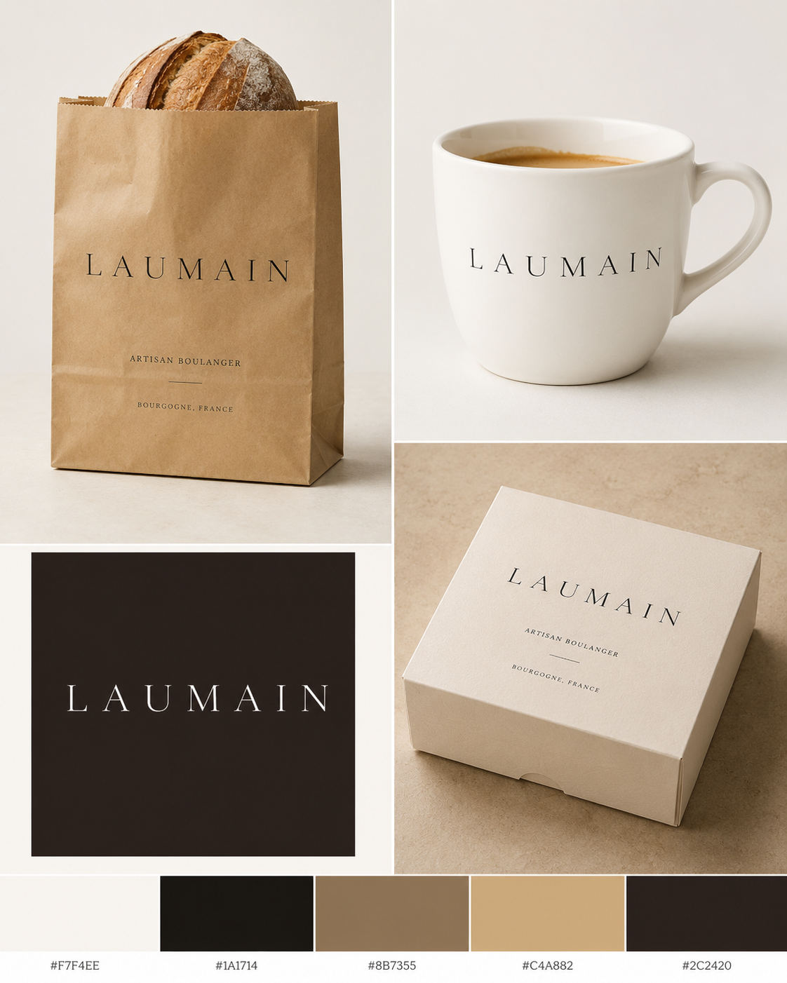
A complete brand mark in three tiers. At the top, a single wheat ear rendered in precise line work — architectural and clean, nothing rustic about it. At the center, the LAUMAIN wordmark in the same wide-spaced classical serif. At the base, the credential that sets this bakery apart from every other in France: Meilleur Ouvrier de France · 2023, flanked by the two tricolor bars of the MOF collar in blue and red — the only moment of colour in the entire identity, and entirely earned. This direction carries the full story of the baker in a single mark. It stamps, seals, and embosses. It works on a kraft bag, a wax seal, a shopfront window etching, or a business card. The wheat speaks to the craft. The MOF speaks to the mastery. The name speaks for itself.

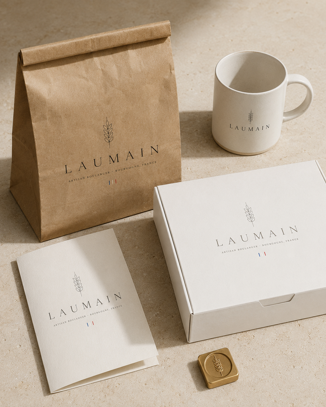
The Direction B mark applied across the complete packaging family — kraft bread bag, ceramic mug, pastry box, menu card, and brass wax seal stamp. This is what the brand looks like in the hands of a customer on opening day. Every touchpoint cohesive, every surface considered. The brass stamp in the foreground is the detail that sets it apart — something you press into wax on a gift box, into dough on a specialty loaf, or cast in metal above the entrance. A mark that earns its place in Puligny-Montrachet.
A Note on This Presentation
Directional Work,
Not Final Deliverables
Everything you have seen in this proposal — the brand directions, logo concepts, packaging mockups, and architectural visualizations — has been created specifically for this conversation. They are directional explorations, intended to show what is possible and to give us a shared visual language before the real work begins.
The actual brand identity process — refinement, vector artwork, type licensing, production-ready files, packaging specifications, and everything that follows — begins in August 2026, on signature. From that point Mango Media commits fully to building something worthy of the baker and the village.
The scope, schedule, and investment that follow reflect what we have already agreed. They are set out here in full so that everything lives in one document — and so that Alexandre, his architect, and his printers are all working from the same dates.
Visual Direction
Bringing Laumain
to Life
These visualisations were created exclusively for this proposal to illustrate the potential of the Laumain brand across packaging, exterior signage, and the interior experience. They are directional — the real work begins once we engage.
The Packaging System
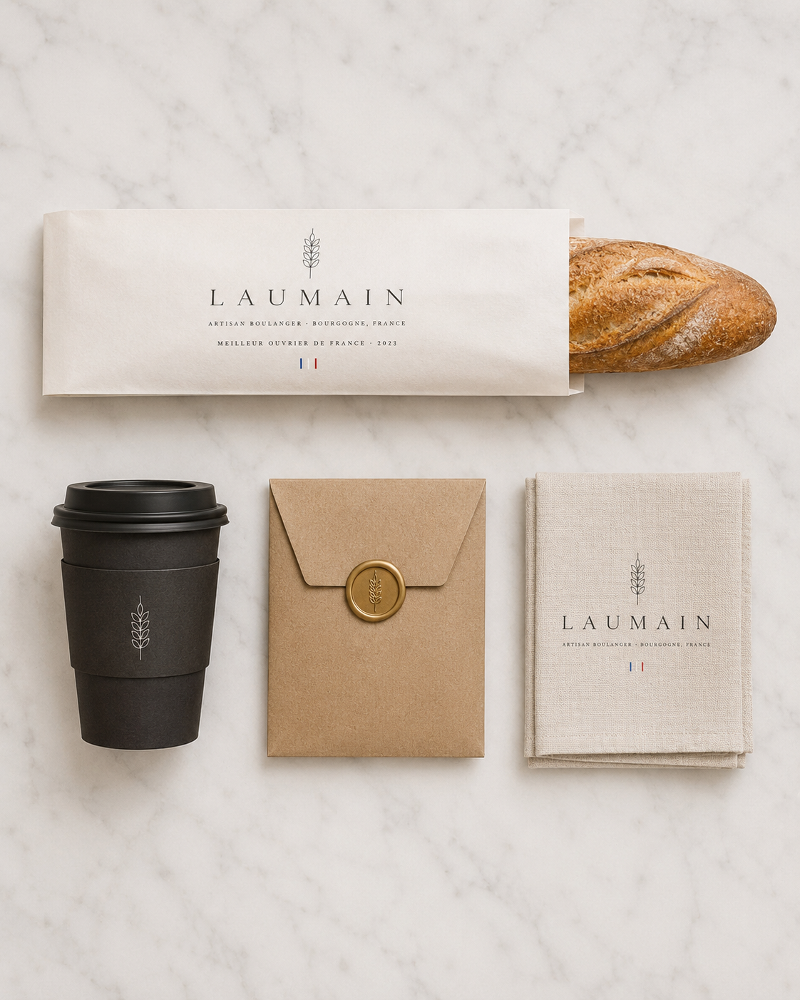
The LAUMAIN mark applied across a second range of packaging touchpoints — baguette sleeve, takeaway coffee cup, kraft envelope with gold wax seal, and linen bread wrap. A different mood from the first mockup: cooler, more editorial, more intimate.
Every surface a customer touches carries the same quiet confidence. No clutter, no explanation needed.
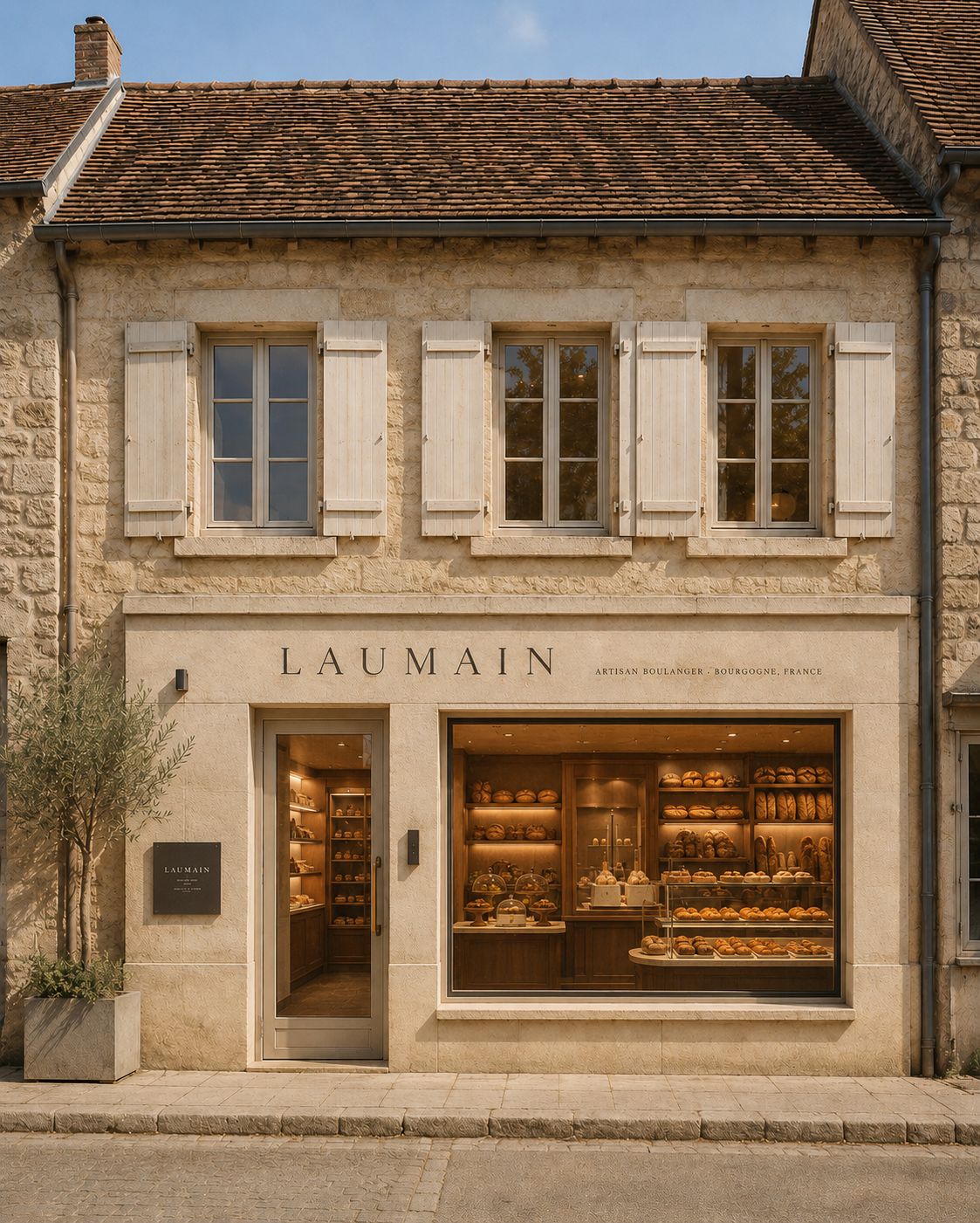
12 Place du Monument
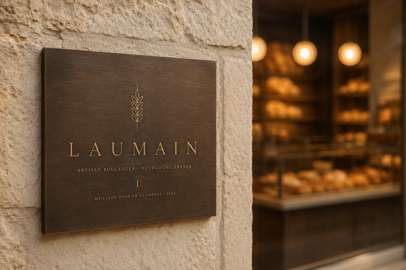
The LAUMAIN wordmark set above the entrance of the rehabilitated Burgundian stone building — architectural, restrained, and immediately legible from the village square.
Through the shopfront window: warm wooden shelving, bread displayed as the hero, pendant lights. Exactly as Alex described — products as decoration, light over everything else.
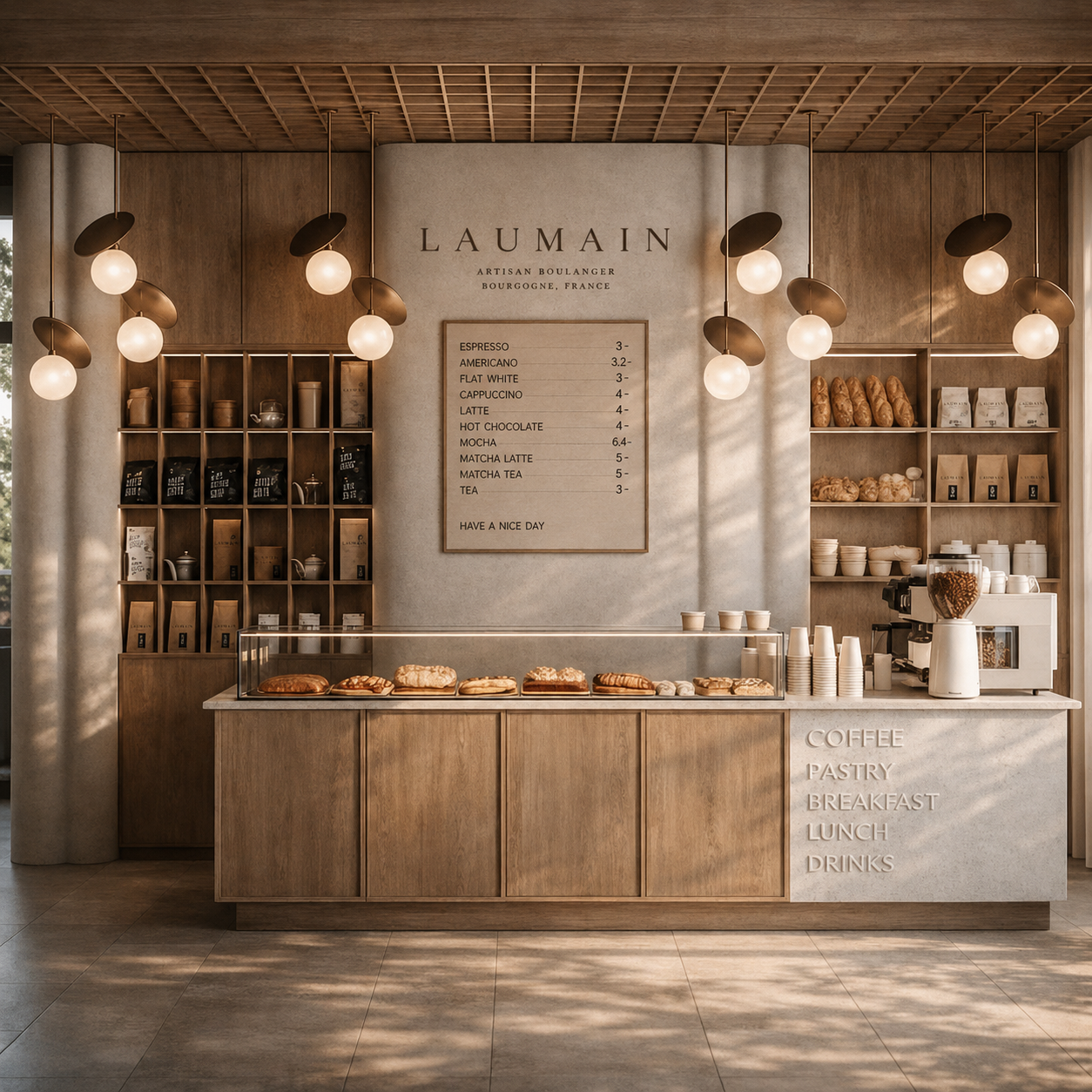
The Experience Inside
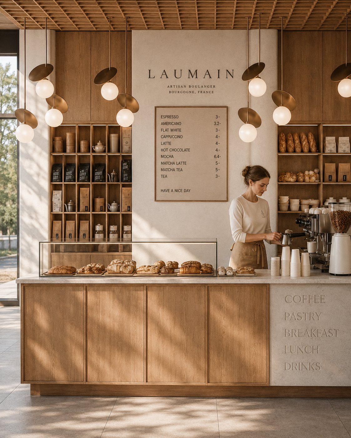
Warm walnut shelving, bread on open display, the LAUMAIN mark above the counter. The brand lives quietly in the space — on bags, on cups, on a small framed menu board — without competing with the products or the light.
The interior tells the same story as the wordmark: mastery without ego.
The Brand Lives
in the People Too
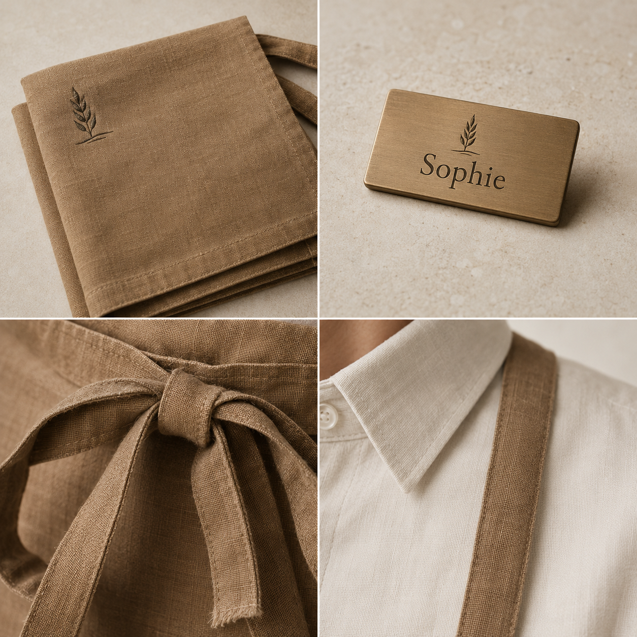
A great bakery is not just a space or a logo — it is the person behind the counter, the gesture of handing over a warm bag, the smell of bread and coffee meeting you at the door. The Laumain brand extends to every human touchpoint.
Staff uniforms in limestone cream with a wheat linen half-apron, the wheat emblem embroidered at the chest. A brushed bronze name tag engraved in the brand serif. Warm, considered, quietly branded — never corporate, never costume.
The same restraint that governs the space governs the people in it.
The Engagement
One fixed fee for the complete build, inclusive of travel to Burgundy. No hourly billing, no surprise line items, no expense reconciliation at the end of the project.
Travel included
This is a package rate for the engagement as a whole. It is not a sum of parts, and it is not the rate at which any single phase would be quoted independently — the photography and film alone would price well above this on a standalone commission. The figure reflects the value of building the entire brand from one hand, in one continuous arc, for a project worth doing properly.
All figures in US dollars. Invoiced by Mango Media LLC, St. Thomas, US Virgin Islands, and payable by international wire transfer. Each invoice states the euro equivalent at the mid-market rate on its issue date, so the amount to be paid is fixed and known before transfer. At today's rate the total engagement is approximately €13,200.
Payment ScheduleIncluded
- All six days on location in Puligny-Montrachet, including flights, lodging, and ground transport
- All photography and video equipment, editing, retouching, and colour grading
- Two rounds of revision at every phase
- Print-ready production files and supplier specifications
- Website design, build, and deployment onto your hosting account
- One year of technical support on the website following launch
- Full commercial usage rights to all imagery, in perpetuity
Not included
- Third-party costs — printing, signage fabrication, packaging manufacture
- Website hosting, domain registration, SSL, and email accounts — see recurring costs below
- Type licensing fees, if a commercial licence is required for the final wordmark
- Paid media, advertising spend, or press distribution wire fees
- Social media management after opening — Phase 05, quoted separately
- A second trip to France, should one be requested beyond the scheduled production week
The website needs somewhere to live. These are annual services billed by the provider, not by Mango Media — held in Alexandre's name, on Alexandre's card, so the accounts always belong to the bakery. We set them up, configure them, and hand over the keys at no additional charge.
Billed in euros by the provider at French pricing, and subject to change at the time of purchase. Two email addresses at launch is typical for a bakery of this size — budget roughly €290 per year for the site and its email to stay live.
One fee, one schedule, one person accountable for all of it. That is the whole arrangement.
Nine months. One bakery. Let's begin.
Countersign the agreement and return the deposit invoice, and discovery starts the same week.
Any question on scope, schedule, or terms — call me directly.
We Build Brands for Places That Matter
Mango Media is a creative agency based at Yacht Haven Grande, St. Thomas, US Virgin Islands. For twenty-five years we have worked with the world's most demanding hospitality brands — building identities, telling stories, and creating the visual language that makes a place unforgettable.
Our founder William Torrillo is a photographer, cinematographer, and storyteller whose work has been featured by National Geographic and the Discovery Channel, and whose clients include Four Seasons, Ritz-Carlton, Marriott, and Hilton. We know what excellence looks like. We know how to build something worthy of it.